Wallcoverings Dana Gibson inspiration Stroheim Fabrics Licensed Collections Licensee Features
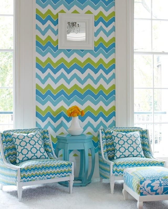
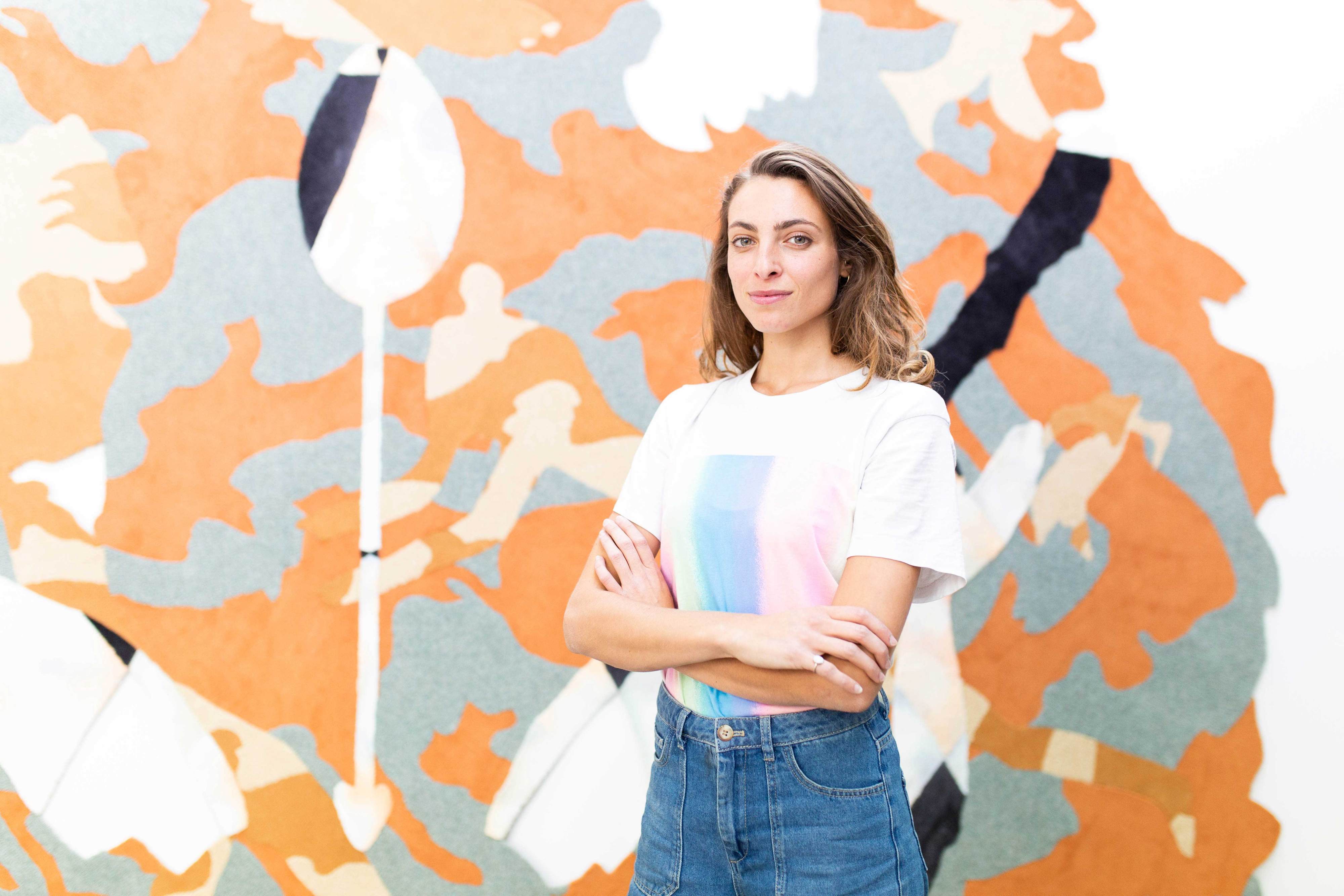
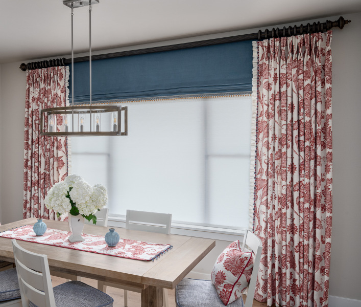
Dana Gibson partners with Stroheim for a fabrics and wallcoverings collection. With the launch of her vibrantly fresh collection, Stroheim sat down with Dana to discuss art, design and her inspirations.
Q1: How would you describe your signature style?
Dana: This is the hardest question of all because I like so many different styles. I would say I am classic with a large dose of bohemian. I like to throw ethnic textiles in with more modern clean looks. It’s kind of how I dress. Whether putting a collection of decorative accessories together or creating a fabric and wallcovering line, you want the components to come together and have a dramatic and interesting effect. Large-scale, bold colors on a neutral ground of white with a touch of something exotic is a perfect formula for a room or for a fabric collection.
Q2: What are your sources of inspiration and who are your design icons?
Dana: I loved art history and learned early on, what’s happening today in art and design references to what’s happened before. The best I can do is to keep my eyes open. Pattern pops up everywhere; in news coverage of the Middle East, on movie sets and in shelter magazines. I love it all and try to put my own spin on what I see. As far as designers go, I guess Sister Parish is a style icon for me as she put a fresh spin on the antiques filled home and was very pragmatic and unfussy. Christian Lacroix is a design idol as well as Matthew Williams, both fearless designers. I like English interior design probably for the same reason.
Q3: What is your favorite possession? Why?
Dana: I really like a press glassed box I found once at a flea market. It’s dressy and jewel-like and has a feeling of preciousness. Other than that, my husband and children, if they count as possessions.
Q4: What is your favorite room in your home? Why?
Dana: My bedroom is probably my favorite place now; we just redid it. My husband is a general contractor so we took the wall down between two rooms and carved out a larger master bathroom. I didn't have any idea of how I wanted it to look until I found a pretty hand-painted Mexican cabinet in turquoise and orange. We pickled the doors to a wall of closets and painted the floor white. It has a serene and airy effect. My favorite linens for a bed are blue and white. The sheets definitely don't match the turquoise accents, which is preferred. Not everything should match.
Q5: How is designing fabrics/wallcoverings different from or similar to your design process for ceramics and other retail products?
Dana: It’s actually very similar. I choose a color palette for a group of products and the goal is to make them intermix. Small-scale and large-scale make an impact together. With the wallpaper and fabric collection, I was able to use more color and saw so many great combinations.
Q6: What intrigued you most about creating a fabrics and wallcoverings collection?
Dana: I have always wanted to design fabrics and wallpaper. When I was 14, my mother hung Laura Ashley wallpaper in my bedroom and it completely transformed my attic room. A room can go from dull to a magical haven. Even one wall papered with a large-scale design is dynamic, so having a line of wallpaper is very exciting. I also have always been intrigued by pattern. There is something comforting about a design repeating over and over.
Next Friday, March 28: 10 Questions with Dana Gibson, Part 2
Tags Wallcoverings Dana Gibson inspiration Stroheim Fabrics Licensed Collections Licensee Features
Fabricut
Our Fabricut marketing team loves sharing design inspiration with our readers, and we've put this blog post together with you in mind!


