2
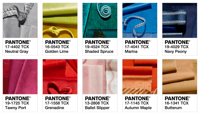
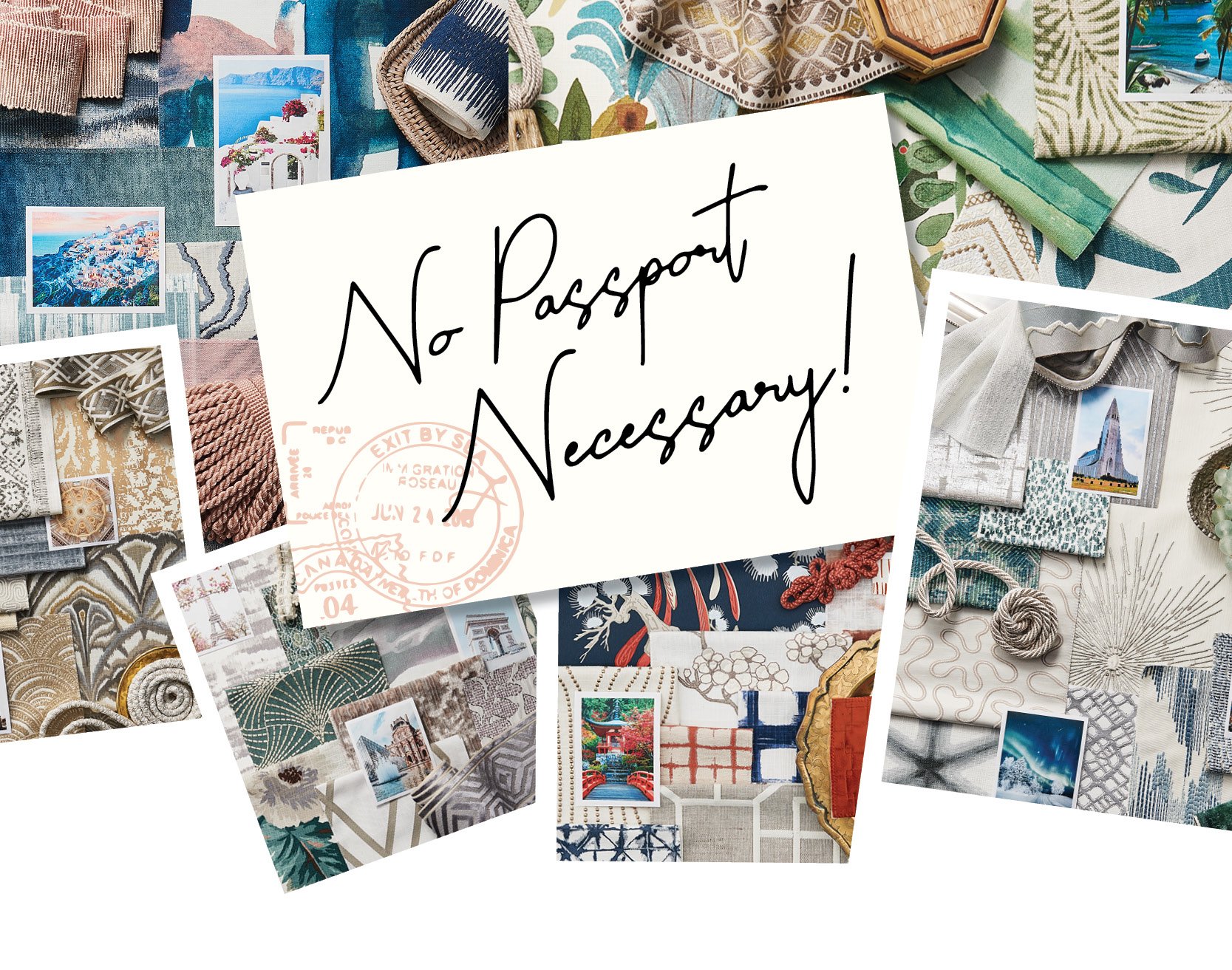
Fall is here and it is ready to inspire! Along with fall comes the time to give our attention to the Fall Pantone Fashion Color Report, which evaluates the colors shown by fashion designers in their collections at New York Fashion Week. Pantone then selected the top 10 colors for men and women's fashions for the upcoming seasons - releasing the Fall palette in Spring, and the Spring palette in Fall [source].
We were so inspired by the fall palette and the gorgeous colors, that we decided to develop a challenge for our design team:
Create a bedroom space using at least three of the Fall Pantone colors to show how color trends can be used to create classic spaces that are trendy and vibrant.
Read on to see three stand-out spaces our team of designers created using colors from the 2017 Fall Pantone Fashion Report as inspiration:
Feminine Chic
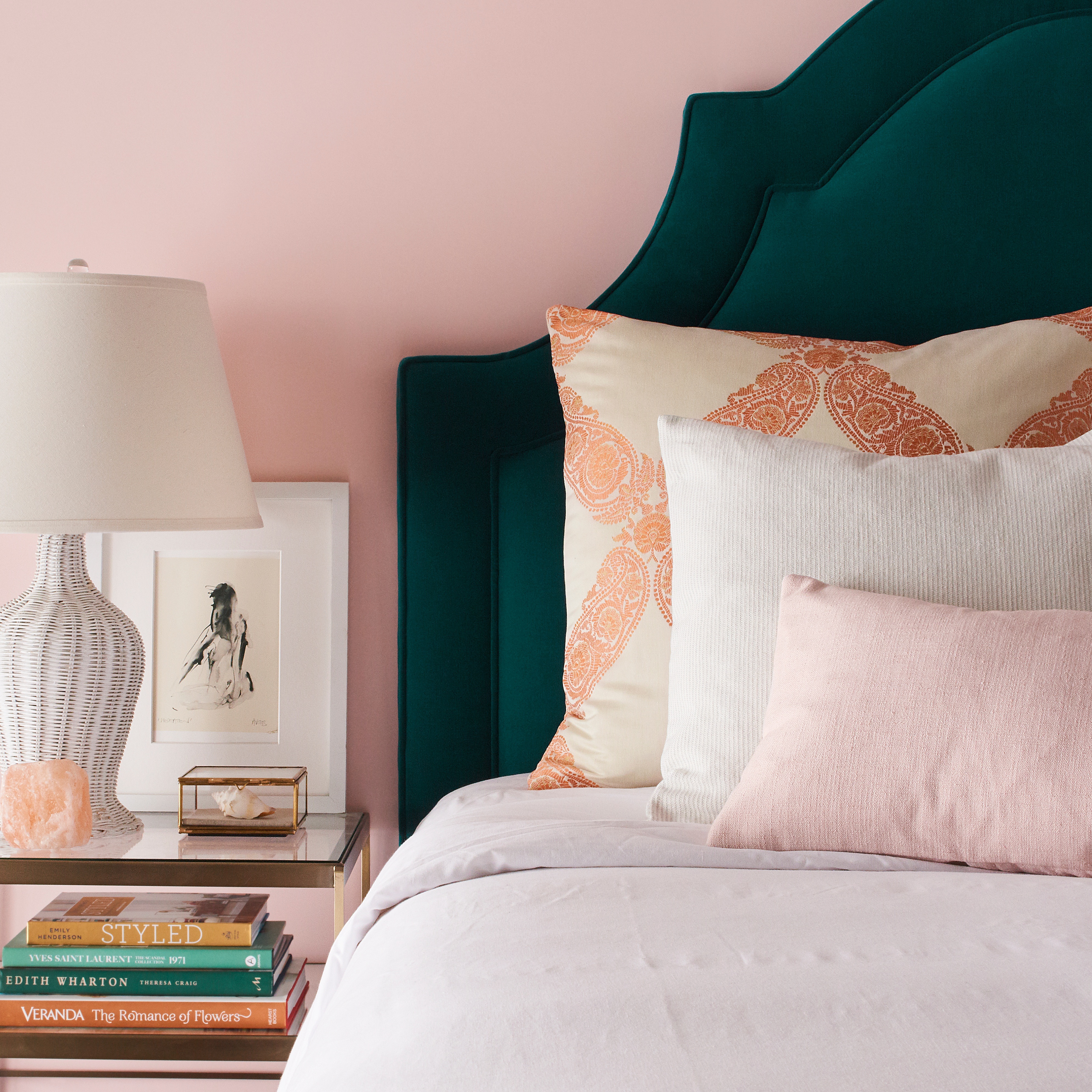
This bedroom filled with millennial pink, deep emerald, and a splash of autumn takes this modern palette to the next level. We love the way that pattern paired with classic solids can breathe life into this warm and fun space.
These are the fabrics used in this space:
 |
 |
| Galon La Mer |
Newport Blossom |
 |
 |
| Saint Maurice Orange Blossom |
Premier Velvet Peacock |
Our favorite part of this design? We love the headboard! It brings so much depth and sophistication to the room. Custom-made pieces like this are just perfect for taking a space to the next level.


Bright Stripes
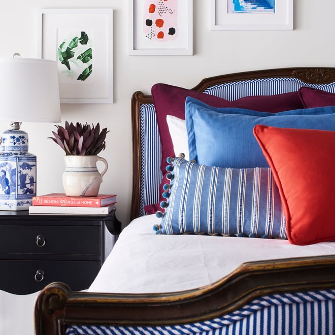
We love a space that brings in different colors through pattern and texture - as well as artwork! This bedroom is a great example of combining similar tones with brighter accent pieces to complete a full look.
These are the fabrics and trimmings used in this space:
 |
 |
| Beckwith Wine |
Protege Fire |
 |
 |
| Capri Bluebell |
Ark Stripe Bluejay |
 |
 |
| Auvillar Bleu |
Boule Lake |
Our favorite part of the design? Stripes! We love a good stripe - especially when it's paired with accent colors that bring a space to life and fill a room with color.


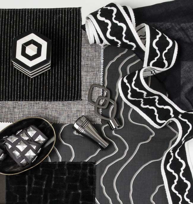
Casually Masculine
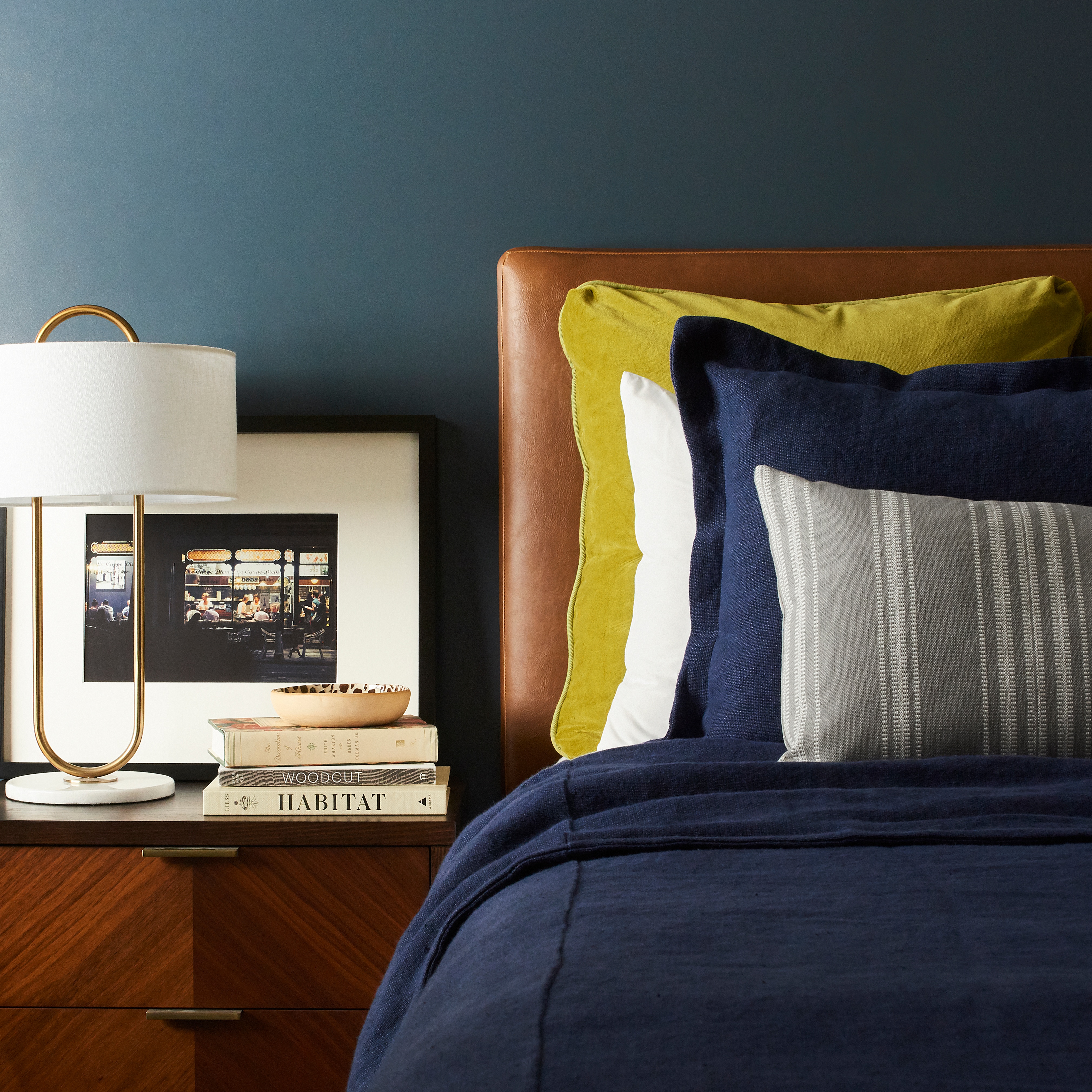
Crafting masculine spaces that feel casual but refined can be a challenge for many designers. In this space, we opted to use some bright accents and simple stripes alongside this dark and moody palette to create a simple but put-together look.
These are the fabrics used in this space:
 |
 |
| Hoffstot Rum |
Boutique Chartreuse |
 |
 |
| Albi Linen Indigo |
Focaccia Platinum |
Our favorite part of the design? The balance of the wall color against that gorgeous custom headboard. Deep and moody tones definitely draw us into this space and bring this masculine design into a heightened level of style.


Want to see more?
Click on each Pantone swatch to see our favorite Fabricut fabrics and trims:

Previous Article
Supporting Local Art: Philbrook Museum Restoration Project