inspiration Pantone Fabrics Collection Highlights Design Inspiration
1

Spring is just around the corner, and a what better way to celebrate this much anticipated change in seasons than with a design refresh featuring PANTONE's 2018 Spring Fashion Color Report!
The PANTONE Fashion Report is a color overview highlighting the top colors fashion designers are showing at NY Fashion Week and will be featuring in their collections for the upcoming season. With these colors walking the catwalk, we can also expect to see these palettes transition into all areas of design including the home. The PANTONE Fashion Color Trend Report is great insight into the season’s most important color trends (via the Pantone website).
How does PANTONE describe the Spring 2018 color palette?
"The Spring 2018 palette encourages a sense of fun and playful release. With an air of complexity and distinctiveness, we find ourselves in a sanctuary of color that is ideal for some more unique and dramatic color mixing."
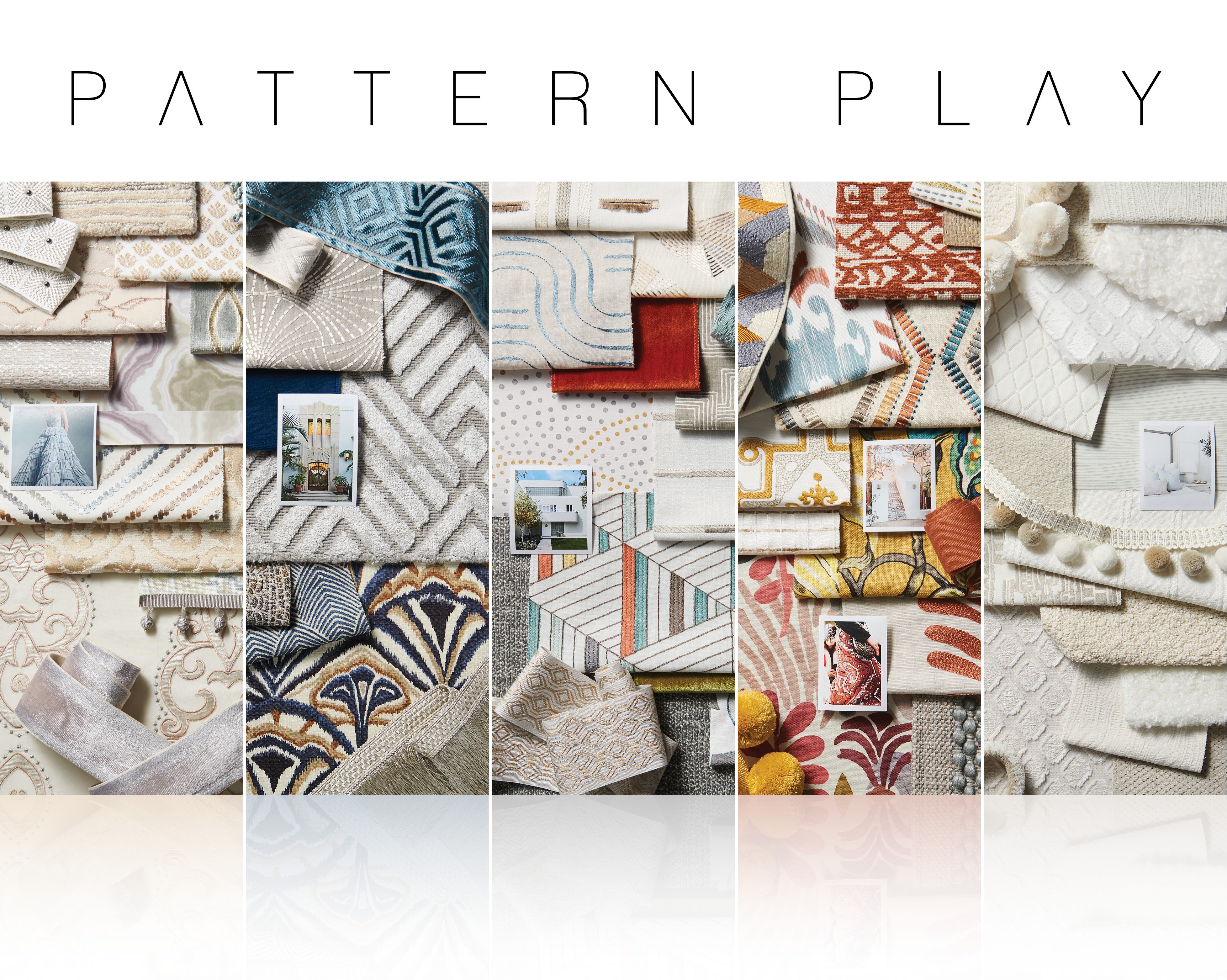
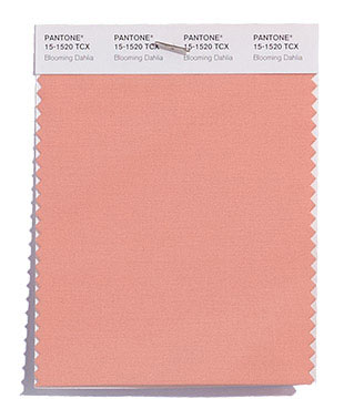
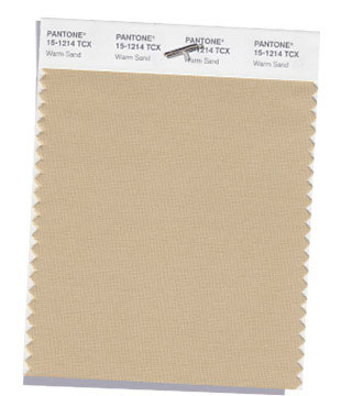
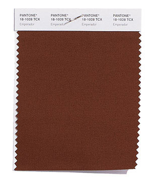
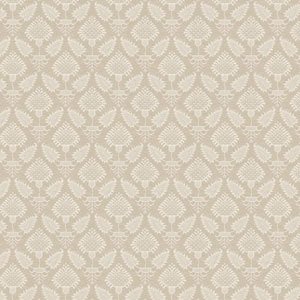
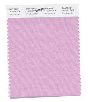
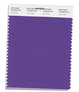
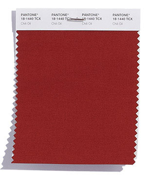
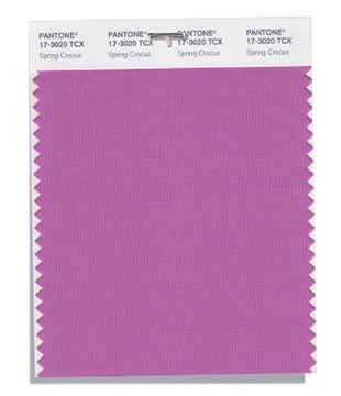
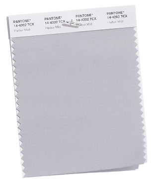
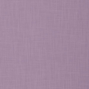
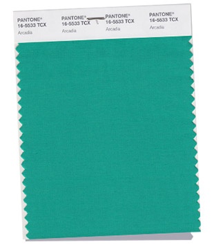
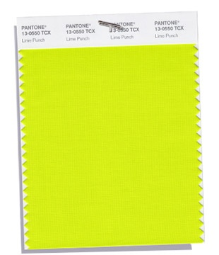
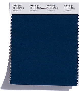
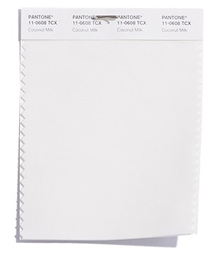
We've grouped PANTONE's Spring Fashion Color Report - featuring twelve top colors and four classic colors - into three color stories and had our designers refresh their personal work spaces. See how these colors paired below.
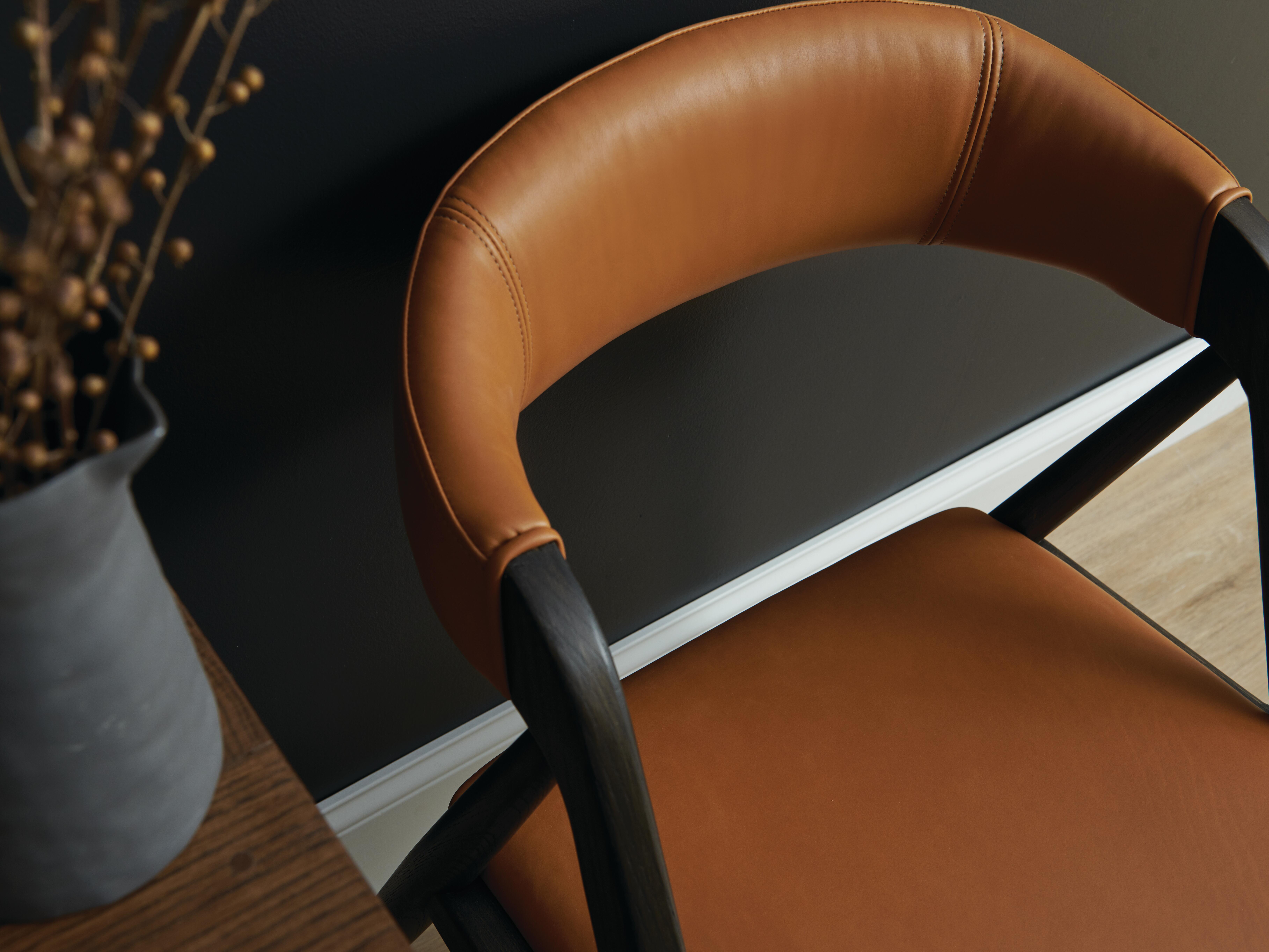
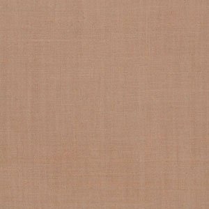
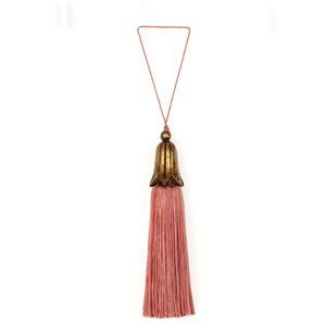
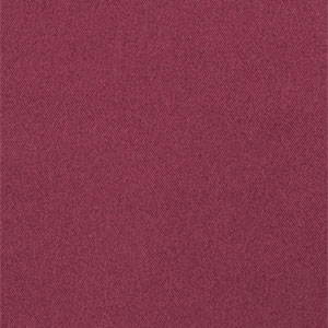
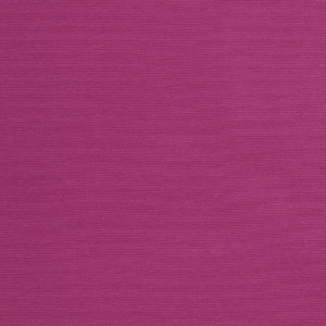
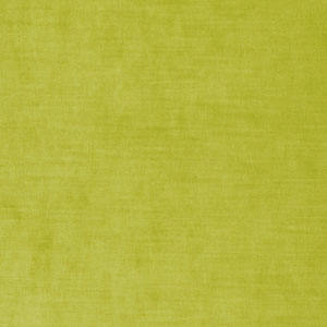
This designer went for a playful, yet refined color story. They love to work with color, and selected similar tones and hues for their work space. Delving into pinks and neutrals, adding a splash of yellow, and pairing color with traditional accessories and textures, this desktop does reflect our designers' playful side.

Feeling Inspired? Take a look at our favorites from this color palette:


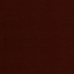

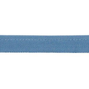
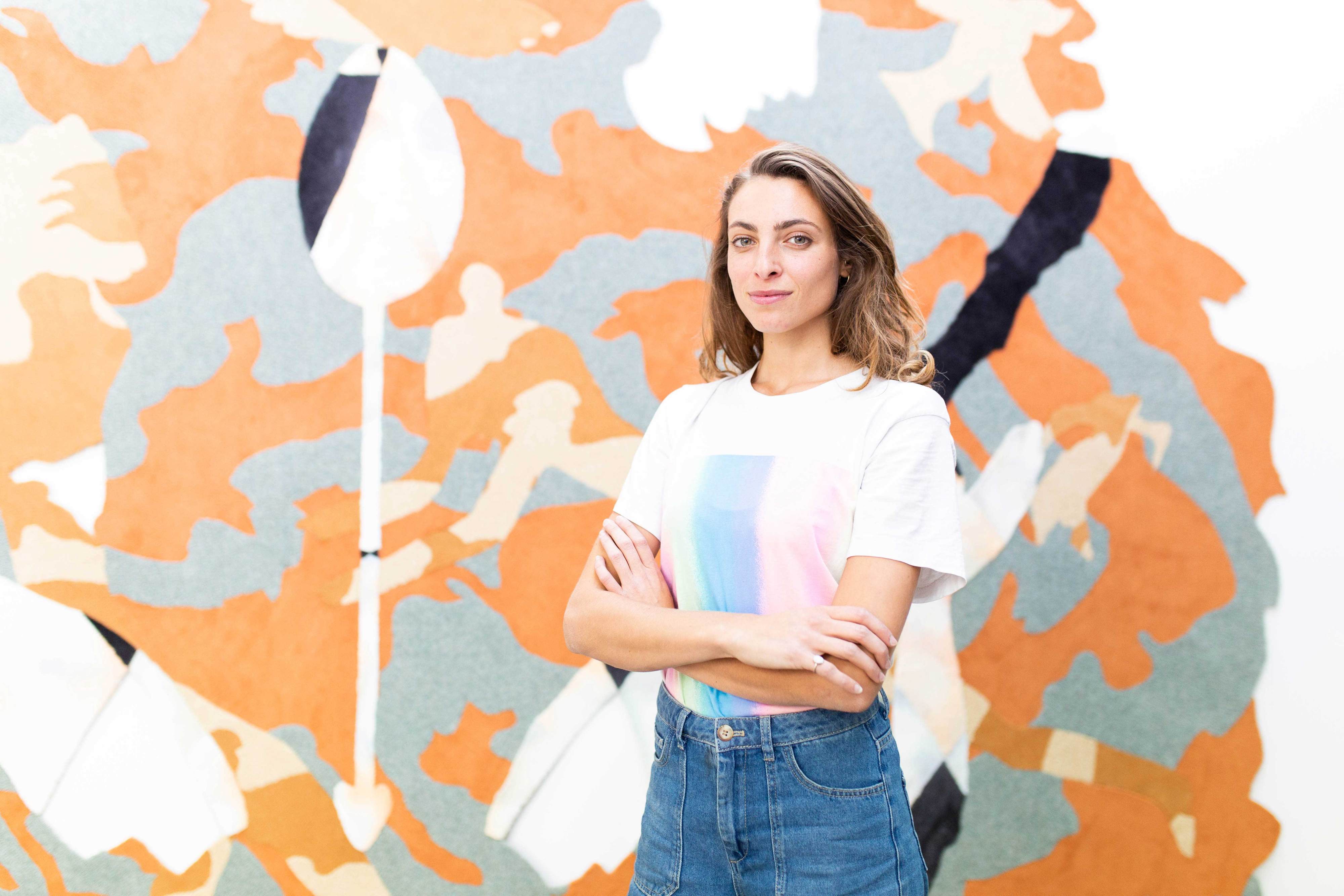
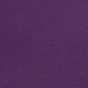
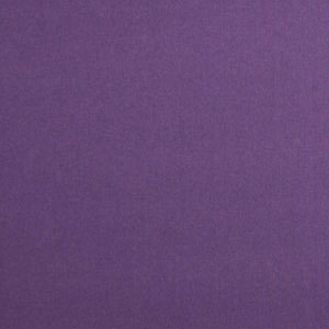
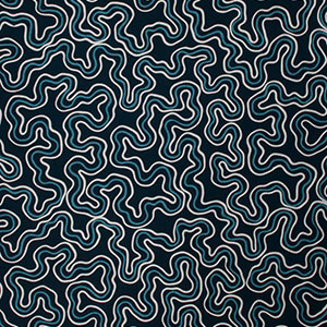
Never afraid of jewel tones or vibrant colors, this designer uses modern art and structural details as a way to organize their designs into an approachable palette. Featuring the PANTONE Color of the Year - Ultra Violet, this design style is a match for any client who wants that WOW factor in their own space, but doesn't want to overpower their minimalistic tendencies with too much pattern.

Loving this palette? Us too! Check out our favorites:
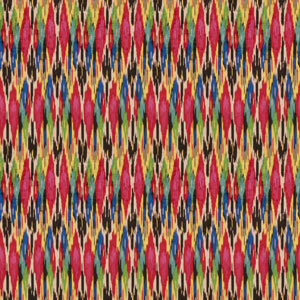

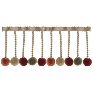
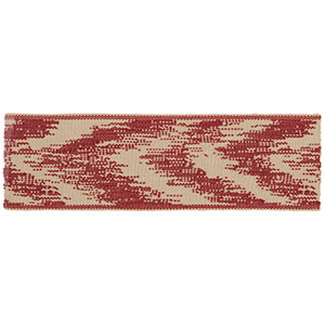
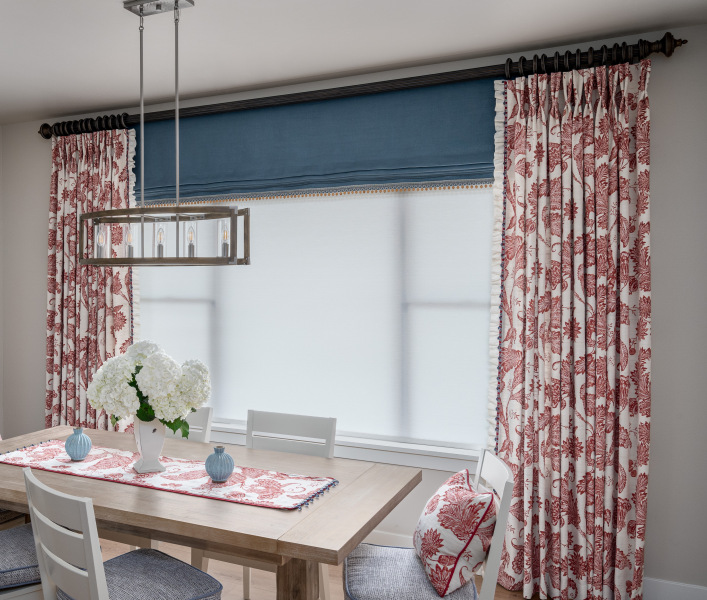
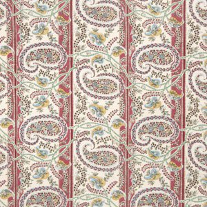
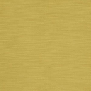
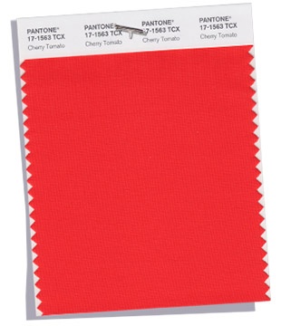
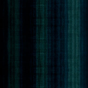
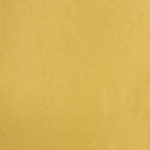
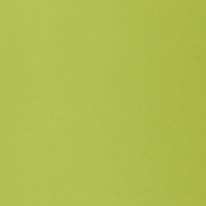
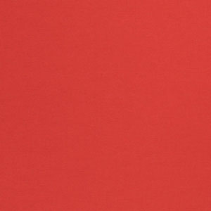
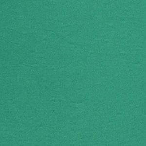
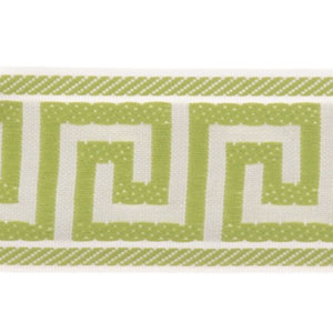
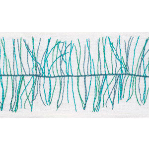
A lover of color and texture, this designer enjoys building spaces that surprise and delight. By layering shades of green and blue, and adding pops of red and yellow, they have added energy and complexity to their work space. Cheerful and adventurous, this palette is perfect for a client who is willing to take risks with color through accessories, trimmings, and bold statement pieces.

Feeling the fresh, springy vibe of this color palette? Here are our favorites:

Which colors will you use to inspire your next design?
inspiration Pantone Fabrics Collection Highlights Design Inspiration