Trimmings Wallcoverings Stroheim Vervain Fabrics Collection Highlights Design Inspiration
0

Cashmere's namesake color has the same effect on the eye as the delicate wool itself: calming and downy soft. This pure neutral color brings extravagance and grace to the interior palette.
In the world of couture fashion, cashmere is being paired with crisp white to highlight the fresh neutral shade. Cashmere's warm and clean neutral tone is a pleasing accompaniment and base for nearly every color in the spectrum. Our designers pulled fabrics, trimming and wallcovering from our Vervain and Stroheim brands to create a serene design scheme that lends the same irresistible-to-the-touch look as cashmere itself.
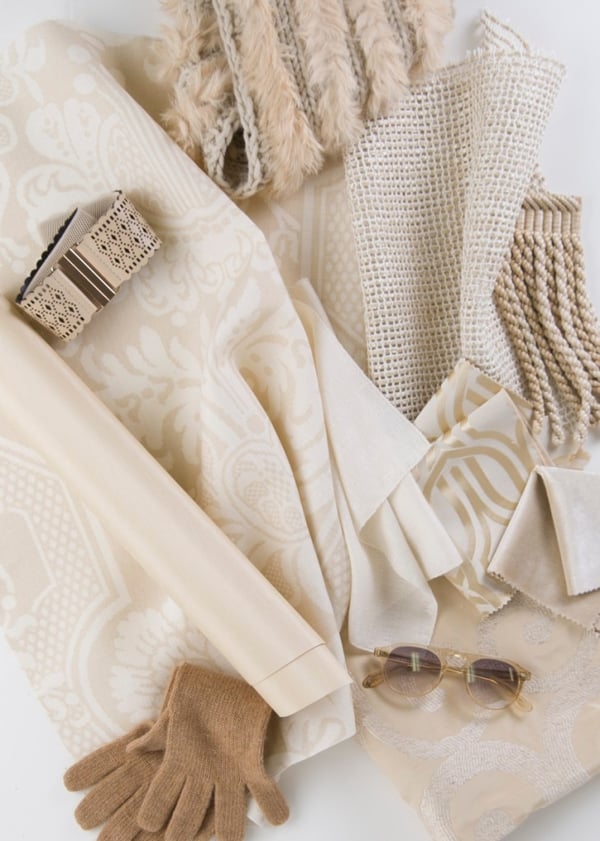
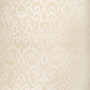
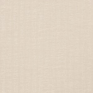
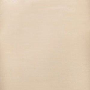
Featured Stroheim and Vervain products (clockwise from the top): Swanky Leno – Meringue (01), Banani – Natural (01), Cabrini – Gardenia (01), Silk Velvet – Cashew (02), Silvana – Natural (02), Angora Sheer – Snow Sky (03), Sabang Silk – Champagne (02), Trocadero – Sahara (02)
Swanky Leno
Meringue 01
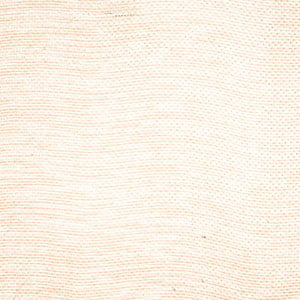
Banani
Natural 01
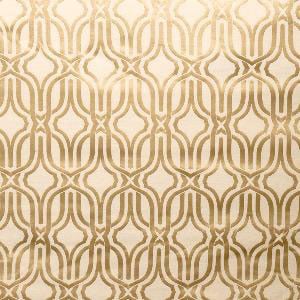
Cabrini
Gardenia 01
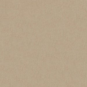
Silk Velvet
Cashew 02
Silvana
Natural 02
Angora Sheer
Haze 01
Sabang Silk
Champagne 02
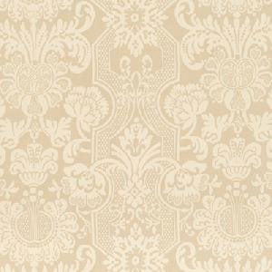
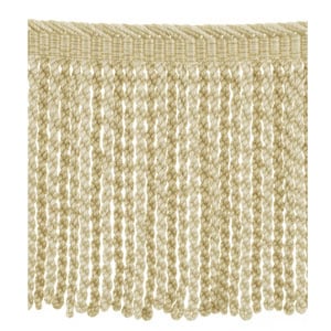
Trocadero
Sahara 02
How are you using cashmere tones in your design projects? What are some of your favorite ways to work this soft neutral into a room?
Speaking of ideas...do you have a great design scheme or project featuring Fabricut brand products you'd like to share with our audience? Eager to share your thoughts on the latest design trends? We'd love to hear from you. Complete our guest blogger application below, and we'll be in touch.

Trimmings Wallcoverings Stroheim Vervain Fabrics Collection Highlights Design Inspiration